This project is a way to implement a anchor tabs panel like the one of the rhymit.
The idea is that sometimes you have a big list where you can scroll, but you still want buttons to help the user to navigate to different scroll positions, and also want that the selected button keeps updated as you scroll
Anchor tabs provide a great user experience as it let the user do what they like most: keep scrolling. While providing a way to navigate to specific positions of that scroll.
I made this video explaining how to use this package:
https://www.youtube.com/watch?v=CPql7o1utiM
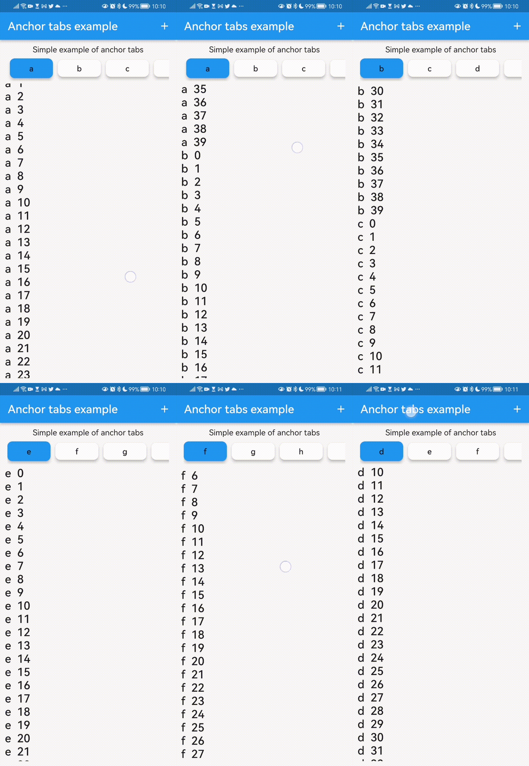
Tab button scroll to the block Scrolling will update the tab button selected
Add the dependency to your pubspec.yaml:
anchor_tabs: ^0.1.0
class SimpleExample extends StatelessWidget {
  const SimpleExample({
    super.key,
  });

  @override
  Widget build(BuildContext context) {
    final DateTime today = DateTime.now();

    final List<String> tabsText = [
      'Today',
      'Yesterday',
    ];

    for (int i = 2; i < 10; i++) {
      final DateTime pastDate = today.subtract(Duration(days: i));
      tabsText.add('${pastDate.day}/${pastDate.month}');
    }

    final List<Widget> tabs = [];
    final List<Widget> body = [];

    for (final element in tabsText) {
      // Create a tab item
      tabs.add(Text(element));

      // Create a target item
      body.add(
        ListView.builder(
          scrollDirection: Axis.vertical,
          shrinkWrap: true,
          controller: ScrollController(),
          itemCount: 40,
          itemBuilder: (BuildContext ctxt, int i) => Text(
            '$element  $i',
            style: Theme.of(ctxt).textTheme.headlineSmall,
          ),
        ),
      );
    }

    return Container(
      margin: const EdgeInsets.all(10),
      child: Column(
        children: [
          const Text('Simple example of anchor tabs'),
          Expanded(
              child: AnchorTabPanel(
            tabs: tabs,
            body: body,
          )),
        ],
      ),
    );
  }
}You can now customize selected/unselected colors (including your app secondary color), text styles, elevation and spacing:
AnchorTabPanel(
  tabs: tabs,
  body: body,
  tabStyle: AnchorTabStyle(
    selectedBackgroundColor: Theme.of(context).colorScheme.secondary,
    unselectedBackgroundColor: Theme.of(context).colorScheme.surface,
    selectedTextStyle: TextStyle(
      color: Theme.of(context).colorScheme.onSecondary,
      fontWeight: FontWeight.bold,
    ),
  ),
)
By default, selected tab labels use onSecondary and unselected labels use onSurfaceVariant for better contrast.
This AnchorTabPanel widget have more fields like the one to configure the size of the tab buttons
Package url: https://pub.dev/packages/anchor_tabs
For memory management reasons, this package also has an experimental anchor_tab_panel_builder that uses a list view to build the body elements only when the scroll positions are near them. This is a great way to improve the performance of your app.
Eager to hear feedback on that feature, so if you have some problem with it please create an issue or a pull request in the github repository.
class TestAnchorTabPanelBuilder extends StatelessWidget {
  @override
  Widget build(BuildContext context) => Scaffold(
        appBar: AppBar(
          title: const Text('Anchor Tab Panel Test'),
        ),
        body: AnchorTabPanelBuilder(
          tabBuilder: (BuildContext context, int index) {
            debugPrint('Tab builder called for index: $index');
            return Text('Tab ${index + 1}');
          },
          bodyBuilder: (BuildContext context, int index) {
            debugPrint('Body builder called for index: $index');
            return Container(
              height: MediaQuery.of(context).size.height,
              width: MediaQuery.of(context).size.width,
              color: index % 2 == 0 ? Colors.orange : Colors.green,
              child: Center(
                child: Text(
                  'Body ${index + 1}',
                  style: const TextStyle(
                    fontSize: 24,
                    color: Colors.white,
                  ),
                ),
              ),
            );
          },
          itemCount: 100,
          animationDuration: const Duration(milliseconds: 1000),
          animationCurve: Curves.ease,
          tabHeight: 35,
          selectedTabHeight: 40,
        ),
      );
}AnchorTabPanelBuilder now tracks the selected tab using ItemPositionsListener from scrollable_positioned_list, instead of adding one visibility detector per body item.
This reduces overhead on large lists and keeps updates smooth when item counts are high.
If you have some problem that this package doesn't solve feel free to contribute on github https://github.com/ivofernandes/anchor_tabs
dart pub publish